
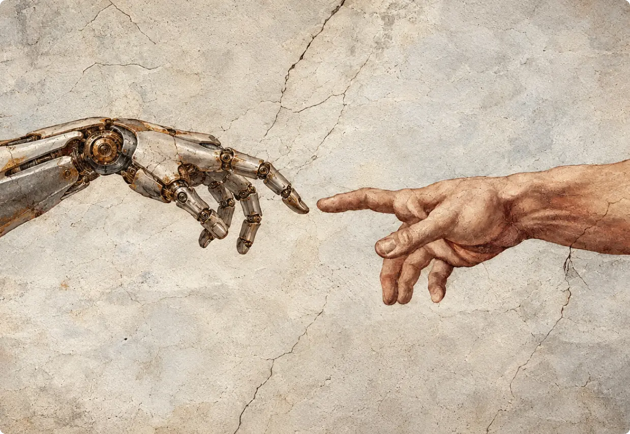
The best designers are moving from execution to strategy, directing AI tools, curating outputs, and solving the problems machines can’t see.
From Tool to Capability Layer
AI adoption among enterprises doubled in the first half of 2025, jumping from 5% to 10%. By early 2026, ChatGPT had reached 800 million users. These aren’t abstract milestones. They signal something concrete: AI has crossed the threshold from occasional tool to embedded capability layer.
For UX design, that shift is structural. AI is now woven into research, ideation, wireframing, and optimization. Teams using it well are seeing 20-30% reductions in build time and project costs. The bottlenecks that once defined design timelines are breaking open.
But here’s what the headlines miss. AI isn’t replacing designers. It’s changing what designers do. The best ones are moving from execution to strategy, from drawing every screen to directing the machine, curating the output, and solving the problems AI can’t see.
Here’s what’s actually changing.
The Three Ways AI Is Changing the UX Workflow
1. Research and Ideation Acceleration
User research has always been slow. Transcribing interviews, tagging notes, clustering sentiment across dozens of sessions. That work used to take days. AI compresses it to hours.
Tools now handle the heavy lifting: auto-transcription, sentiment tagging, pattern clustering across qualitative data. What changes for the designer isn’t the insight. It’s the speed of getting there.
AI also widens the solution space earlier. It can generate alternative user flows and surface edge cases during brainstorming that a human team might not reach until week three. That means strategic decisions happen sooner, with more options on the table.
The designer’s role in this phase isn’t to do less. It’s to do different. Frame the right questions. Interpret the patterns. Make the calls that require judgment, context, and human understanding.
2. AI Wireframing: Breaking the Bottleneck
Manual wireframing was one of the most expensive time sinks in any digital project. Weeks could pass before a client saw a clickable prototype. By then, direction had already calcified.
That timeline has collapsed. With tools like Figma AI, Replit, Loveable, and UIPilot, teams are moving from concept to prototype-ready spec in 3-5 weeks. Production-ready version one is achievable in 10-14 weeks. That’s a meaningful compression for any business trying to move fast.
Designers aren’t drawing every screen anymore. They’re directing the structure and refining the output. The craft hasn’t disappeared. It’s shifted upstream. Faster prototypes mean faster client feedback, more iteration cycles, and better final products.
3. Designing for Machine Trust: The New Audience
This one catches most teams off guard. Websites are now evaluated by AI systems before humans ever see them. When someone asks ChatGPT, Perplexity, or a Google SGE result for a recommendation, those systems are reading your site and making trust decisions.
The signals they look for: content depth (not just what you do, but why it matters), consistency across pages, visible leadership and credentials, and structural clarity. These are E-E-A-T signals, and they’ve become UX requirements, not just SEO considerations.
If AI systems don’t trust your site, they won’t surface it in generative search results. That’s a visibility problem with a design solution. Structure, transparency, and depth need to be built into the experience from the start.
The real value of AI in design isn’t replacing creativity. It’s making more room for human insight and better decisions.
What Designers Are Becoming: The Editorial Role
The value of a UX designer is shifting. Low-value work is shrinking fast: manual tagging, repetitive wireframing, basic layout decisions. AI handles those now.
What’s expanding: framing problems, interpreting human behavior, making ethical calls, and curating AI output with judgment.
The best way to understand this shift is through the concept of the editorial designer. Like an editor at a publication, this person doesn’t write every word. They direct, evaluate, correct, and make the final call on what ships. They know which of 20 AI-generated outputs is actually right for this user, this context, this business goal.
Take Streetbeat, a fintech platform built around AI-driven investment insights. The UX challenge wasn’t generating the insights. It was translating AI model outputs into interfaces that felt trustworthy and responsible to real users. That required human judgment at every turn.
The skills that matter now:
Prompt engineering: Directing AI tools to produce useful, accurate output
Strategic thinking: Staying focused on the actual problem being solved
Curation judgment: Knowing which output is right, and why
Ethical oversight: Catching bias, protecting privacy, maintaining transparency
AI makes production faster. Humans make it meaningful.
The AI-First UX Patterns Emerging Right Now
As AI transforms the design workflow, it’s also creating entirely new interface paradigms. Designers who understand these patterns now will be ahead of the curve.
Conversational and Generative UX
This goes well beyond chatbots. Modern AI interfaces generate custom outputs: personalized summaries, dynamic recommendations, tailored plans. Designing for these experiences means thinking in natural language intent, not just buttons and menus. The interaction model has changed. The design language needs to follow.
The Three States of AI
Every AI-powered interface operates in one of three states, and designers need distinct patterns for each:
1. Likely right: Show confidence. Enable quick action without friction.
2. Uncertain: Present options. Explain the reasoning. Let the user decide.
3. Wrong: Escalate to a human. Explain what happened and why.
When an interface changes without explanation, trust breaks. Users don’t need AI to be perfect. They need it to be honest.
AI-First UI Elements
A new vocabulary of UI components is emerging:
Pre-prompt interactive buttons that guide users before they type a query
Voice integration for hands-free interaction across contexts
Memory management that lets AI retain context across sessions
Intentional latency cues that signal the AI is processing, setting accurate expectations
These aren’t decorative features. They’re functional trust mechanisms.
Ethical Guardrails
AI-first design carries real responsibility. The patterns that protect users:
Privacy by design: Clear consent flows, data minimization built into the architecture
Bias mitigation: Human review of AI recommendations before they reach users
Explainability: Showing users why the AI made a specific recommendation
Human-in-the-loop: Clear escalation paths for decisions AI shouldn’t make alone
These aren’t optional considerations. They’re the foundation of user trust in AI-powered products.
Ready to update your website? Get in touch with us for a consultation. AI Changes the Methods. Humans Define the Mission.
AI can wireframe faster, analyze research data in minutes, and generate interface variations at scale. But it can’t frame the right problem. It can’t feel what users feel. It can’t make ethical calls or build trust through empathy.
The designers thriving right now aren’t the ones fighting AI. They’re the ones using it to eliminate the bottlenecks, so they can spend more time on the work that actually matters: understanding humans, solving real problems, and building experiences that feel right.
At Bright Nation, we design at this intersection. Strategic, AI-informed, and always grounded in what your users actually need. If you’re ready to build something that works as well as it looks, let’s talk.
Article Tag: UI/UX Design
The Web Design Process That Performs: 7-Step UX/UI Process for 2026

Great websites are not accidents. They are the result of a disciplined web design process that integrates UX research, UI craft, and strategic execution from day one.
Great design is not magic. It is a methodology.
A beautiful website that confuses visitors is an expensive mistake. A logically structured site that looks unpolished loses trust before a single word is read. The truth most agencies won’t tell you: neither great UX nor great UI is enough on its own. Both require a structured, repeatable process to become a genuine business asset.
UX vs. UI: Understanding the Partnership
These two terms get used interchangeably. They should not be.
UX: The Invisible Engine
User Experience (UX) is everything the user feels but rarely sees. It is the logic beneath the surface: journey mapping, user research, competitor analysis, and information architecture. UX asks one question above all others: Does this solve the user’s problem efficiently?
Slack’s communication flow is a masterclass in UX. Users move between channels, threads, and direct messages without friction because every decision about structure was made before a single pixel was placed. Notion’s modular workspace works the same way — the UX is so well-considered that the interface feels like it reads your mind.
UX/UI designers in the US earn an average of $123,000 annually. That salary reflects the strategic weight of the role. This is not decoration work.
UI: The Visual Touchstone
User Interface (UI) is what the user actually sees and interacts with. Typography, color theory, button states, spacing, animation, responsive behavior across devices. UI asks: Is this intuitive and visually engaging?
Figma’s interface is the benchmark here. Its real-time collaboration UI manages extraordinary complexity without overwhelming the user, because every visual decision serves a functional purpose. That is UI at its best.
The Synergy
UX defines the journey. UI makes it beautiful. One without the other produces a site that either works but looks amateur, or looks stunning but haemorrhages conversions. The web design process exists to ensure both disciplines are integrated from the start, not bolted together at the end.
A 7-Step UX/UI web design process that separates high-performing sites from expensive disappointments
This is not a waterfall. Each step informs the next, and insights from later stages regularly loop back to refine earlier decisions. Think of it as a disciplined cycle, not a straight line.
Step 1: Strategy and SMART Goals
Every project starts with a question: what does success look like, measured specifically? Not “more traffic” but “150 qualified leads per month” or “a 20% increase in trial sign-ups within 90 days.” Compliance targets belong here too. In 2026, WCAG 2.2 AA accessibility is a baseline requirement, not an optional extra.
Step 2: Systemic Roadmap
Plan systems, not just pages. A sitemap tells you what exists. A content model tells you how content is structured and reused across the site. Component-based design — building with reusable blocks rather than one-off page templates — dramatically reduces development time and future maintenance costs.
Apply the 3-click rule here: any key content a user needs should be reachable within three clicks from the homepage. If your information architecture fails this test, your navigation will fail your users.
Step 3: Content and SEO
Content is not filler. Every page should answer a specific user question and serve a defined purpose in the conversion journey. Headings need to be structured for both human readers and AI-driven search. Copy should be written with search intent in mind from the start, not retrofitted for SEO after the design is locked.
Step 4: Performance-First Development
Set a performance budget before the first line of code is written. This means defining acceptable thresholds for page weight, script load, and rendering time, then building to stay within them. The 2026 Core Web Vitals standards are clear:
INP (Interaction to Next Paint): under 200ms — this metric has replaced FID as the primary responsiveness measure
LCP (Largest Contentful Paint): under 2.5 seconds
CLS (Cumulative Layout Shift): under 0.1
Next-gen image formats — WebP and AVIF — are now table stakes, not advanced optimizations.
Great websites start with a strong strategy and disciplined process.
Step 5: Three-Pillar QA
Quality assurance should cover three non-negotiable pillars before any launch discussion begins:
Accessibility: Keyboard navigation flow, color contrast ratios meeting WCAG 2.2 AA, screen reader compatibility
Performance: Load speeds tested across real mobile devices on varied connection speeds
Privacy: Analytics implementation, consent banner compliance, legal data handling requirements
Skipping any one of these pillars is a liability, both legally and in terms of search ranking.
Step 6: Secure Launch and Analytics
Launch day is the start of data collection, not the finish line. Event tracking should be verified and live before the site goes public. User journey monitoring needs to be active from the first session. The data you collect in the first 30 days will shape every optimization decision that follows.
Step 7: Maintenance — The Franchise Mindset
A website is not a static app. It is a living system that requires regular updates, security patches, performance monitoring, and feature iterations based on real user feedback. The most successful digital businesses treat their websites the way a franchise treats its operations: with consistent standards, scheduled reviews, and a commitment to continuous improvement.
Ready to build a site that performs? Please get in touch with us and get free consultation. 2026 Standards and the Mistakes That Will Cost You
What 2026 Requires
The bar for web performance and accessibility has risen significantly. Any site built or rebuilt in 2026 needs to account for:
WCAG 2.2 AA compliance as a legal and ranking baseline
INP replacing FID as the core responsiveness metric in Google’s ranking signals
Core Web Vitals as confirmed ranking factors, not soft recommendations
WebP and AVIF image formats as the standard for image delivery
The Mistakes That Derail Good Projects
These are the failure patterns we see most often:
Cluttered layouts that create cognitive overload and drive users away before they convert
Poor navigation that fails the 3-click rule and forces users to hunt for information
Non-responsive design that breaks the experience on mobile, where the majority of traffic now originates
Skipping wireframes and jumping straight to visual design, which locks in structural problems before they are identified
No performance budget, resulting in bloated builds that fail Core Web Vitals and penalize search rankings
Launching without three-pillar QA, which creates accessibility gaps, legal exposure, and performance debt from day one
The brands that get this right share a common trait. Notion’s modularity means their product scales without structural chaos. Slack’s efficiency means users accomplish tasks faster than on any competing platform. Figma’s collaborative interface means complex workflows feel natural. None of those outcomes happened by accident.
Process Produces Performance
The best websites share one defining characteristic: disciplined process. They begin with UX research that identifies the real problem. They build UI that makes the solution genuinely compelling. And they follow a structured framework that ensures nothing critical is left to chance.
If your current site is underperforming, the root cause is almost always a process gap, not a design gap. Strategy was skipped, QA was an afterthought, or maintenance was treated as optional.
At Bright Nation Studio, we apply this exact framework to every project we take on. Talk to our team about what a disciplined web design process could mean for your business.
You Might Also Like
UX Trends 2026: How Emotional Design Drives Real User Engagement

UX in 2026 is no longer a visual discipline — it’s emotional architecture. The brands winning at user engagement design are the ones removing friction, building trust, and creating experiences so intuitive that technology disappears.
UX as Emotional Architecture
Eighty-eight percent of consumers won’t return to a website after a bad experience. Not a slow one. Not an ugly one. A bad one. That distinction matters.
For years, UX was treated as a visual discipline — color palettes, typography, layout grids. That era is over. The brands gaining ground in 2026 understand that UX is emotional architecture. It’s the difference between a user who bounces and one who buys, returns, and refers.
Personalization, speed, and ethical data handling are no longer differentiators. They’re the baseline. Users arrive with expectations shaped by Spotify, Netflix, and Apple. When your digital experience falls short of that standard, they feel it — even if they can’t articulate why. The goal isn’t to impress users. It’s to remove every reason they might hesitate, doubt, or leave.
Frictionless experiences convert casual browsers into loyal customers. That’s the business case for emotional UX design.
Personalization and Frictionless Security
Effortless Personalization
The best personalization is invisible. Spotify’s dynamic interface shifts based on your listening patterns — time of day, mood signals, recent behavior. Netflix doesn’t show you a catalogue; it shows you your catalogue. These aren’t features users notice. They’re experiences users feel.
In 2026, user engagement design demands real-time behavioral adaptation: customized dashboards, predictive content sequencing, and interfaces that learn without asking. Users shouldn’t have to configure their experience. The experience should configure itself.
Biometric Security
Password friction kills conversions. Studies on biometric authentication consistently show significant reductions in login abandonment when facial recognition or fingerprint scanning replaces traditional password flows. The principle is simple: security that doesn’t feel like security is better security.
When a user unlocks your platform with a glance, they don’t think about authentication. They think about what they came to do. That cognitive shift is worth more than any feature you could add.
Generative UI
This is the 2026 innovation most brands are sleeping on. Generative UI refers to interfaces that reconstruct their own layout in real time based on a user’s accessibility needs or cognitive style. A user with dyslexia gets increased letter spacing and a different font. A low-vision user gets higher contrast and larger tap targets. A user with cognitive fatigue gets a simplified layout with fewer competing elements.
Personalization isn’t just content anymore. It’s the entire interface.
Interaction, Immersion, and Feedback
Micro-Interactions
A button that responds when you hover. A progress indicator that moves as you complete a form. A celebratory animation when you hit a milestone. These are micro-interactions, and they do heavy psychological lifting.
Duolingo built a loyalty loop around streak counters and celebratory animations. Users don’t just use the app — they feel rewarded by it. The psychology is straightforward: immediate feedback reduces uncertainty and builds confidence. When users know the system is responding to them, they trust it.
Voice and Multimodal UX
Voice search usage continues to grow, particularly on mobile. More than half of all searches are expected to involve voice or image inputs by the mid-2020s. The shift isn’t about novelty — it’s about meeting users on their terms.
Multimodal UX combines voice, gesture, touch, and AI chat into a single coherent experience. For mobile-first audiences especially, reducing reliance on keyboard input removes a layer of friction that costs you conversions.
AR and 3D Experiences
Warby Parker’s virtual glasses try-on and IKEA’s Place app didn’t just create impressive demos. They solved a real business problem: purchase hesitation caused by uncertainty. When users can visualize a product in their space or on their face, return rates drop and purchase confidence rises.
Immersion builds confidence. Feedback builds trust. Together, they create the emotional momentum that drives a user from consideration to conversion.
Strategy, Ethics, and the Trust Economy
Data-Driven Design
Gut instinct is expensive. Behavior data is precise. Tools like Hotjar and Crazy Egg give you heatmaps showing exactly where users click, scroll, and abandon. Pair that with A/B testing on CTA placement, content length, and navigation structure, and you’re making design decisions based on evidence, not assumption.
The brands winning at user engagement design aren’t guessing. They’re iterating.
Accessibility as Standard
Over 1.3 billion people worldwide live with some form of disability. Designing for accessibility — proper color contrast, screen reader compatibility, keyboard navigation — isn’t a compliance checkbox. It’s a market reach decision and a brand reputation signal.
Accessible design also tends to be better design. Cleaner layouts, clearer hierarchy, and more deliberate interaction patterns benefit every user.
Cross-Device Consistency
A user who starts a journey on their laptop and continues on their phone shouldn’t feel like they’ve switched brands. Inconsistent experiences across devices cause mid-journey abandonment. Consistent ones build the subconscious trust that keeps users moving toward conversion.
Digital Sobriety
One of the defining UX trends 2026 brings is Digital Sobriety — a deliberate move away from interfaces designed to maximize time-on-screen at any cost. Ethical design respects user attention. It reduces cognitive load rather than exploiting it. It doesn’t use dark patterns to trap users in flows they didn’t choose.
This isn’t altruism. Users are increasingly aware of manipulative design, and they’re choosing brands that don’t exhaust them.
Privacy as UX
Transparent data handling is now a UX feature. Users align their spending with brands that demonstrate respect for their data. A clear, readable privacy policy, explicit consent flows, and honest communication about data use aren’t just legal requirements. They’re trust signals that influence purchasing decisions.
In 2026, UX is about proving you’re a safe steward of user attention and data.
Make Technology Feel Invisible
The best UX is the kind users never notice. It just works.
Personalization that anticipates needs before users articulate them. Security that protects without creating friction. Micro-interactions that confirm every action without demanding attention. Ethics that demonstrate respect rather than just claiming it.
When you get UX right, users don’t think about the interface. They accomplish their goals and come back. That’s the standard worth building toward.
At Bright Nation Studio, we design digital experiences that operate at this level — where strategy, emotion, and technology converge into something users trust. If your current digital experience isn’t creating that feeling, let’s talk about what it would take to get there.
Your Success Starts Now! Please get in touch with us and get free consultation.
The Future of UI/UX Design: Strategic Shifts Every Brand Must Embrace in 2026
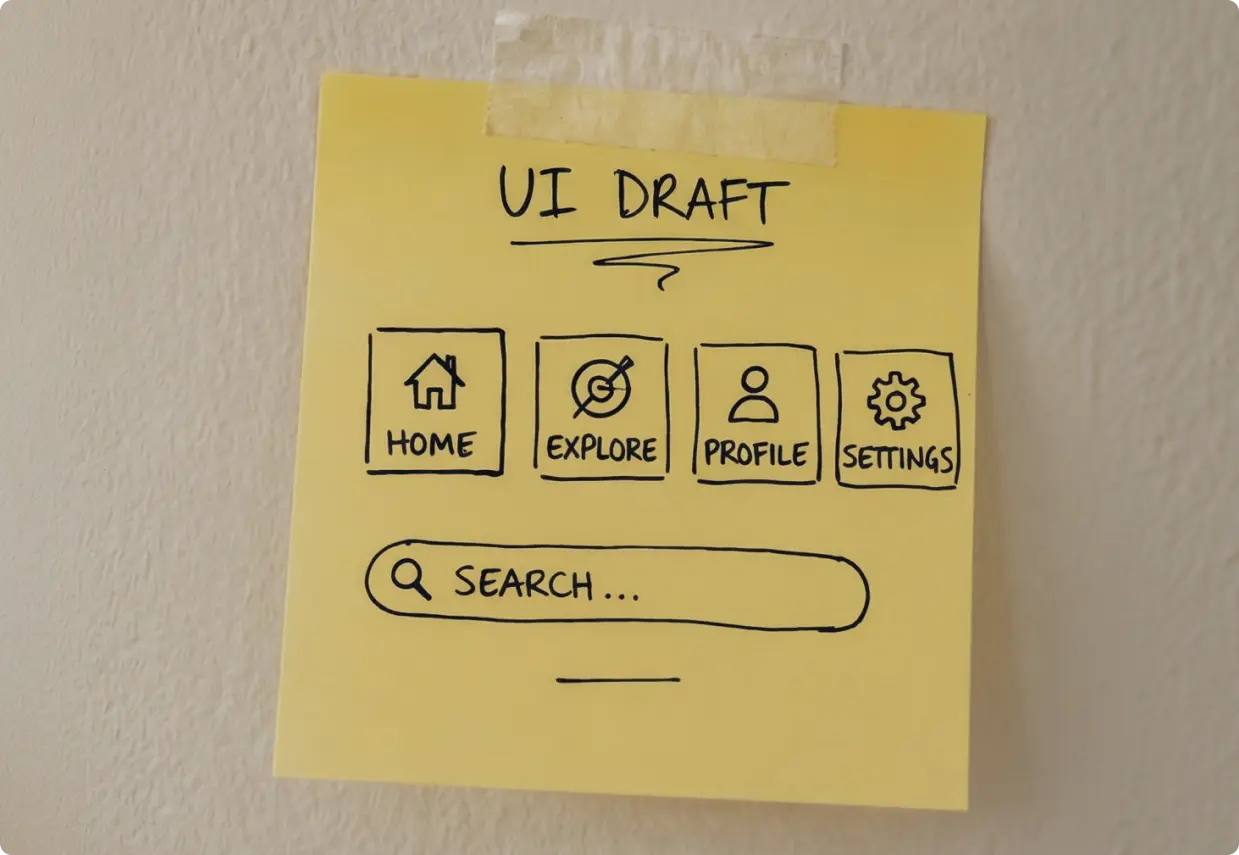
UI/UX design is no longer a creative concern—it’s a business survival issue. In 2026, your digital interface is the primary lens through which customers judge your brand, your credibility, and your competence.
Your Interface Is Your Brand. Treat It That Way.
Users form an opinion about your website in approximately 50 milliseconds. Before they read a single word of your copy, before they see your pricing, before they understand what you sell—they have already decided whether you are credible. That judgment is almost entirely visual and experiential.
This is the new reality of UI/UX design in 2026. Design is no longer a line item in a creative budget. It is a core business function that directly influences revenue, customer retention, competitive positioning, and brand trust. Companies that treat their digital interface as a strategic asset are pulling ahead. Those that treat it as an afterthought are losing ground to competitors who understand what is actually at stake.
The UI/UX design trends shaping 2026 are not cosmetic upgrades. They represent a fundamental shift in how brands relate to their customers through digital touchpoints. Here is what every business leader needs to understand.
1. Predictive Minimalism: Interfaces That Think Ahead
Minimalism in design used to mean removing the unnecessary. In 2026, it means something more sophisticated: removing friction before users encounter it.
Predictive minimalism combines clean visual design with behavioral intelligence. Interfaces now adapt based on who is using them, what they have done before, and what they are most likely to need next. This is not simplification for its own sake—it is precision.
Generative UI and Anticipatory Design
Generative UI takes this further. Rather than presenting every user with the same interface, the layout, content, and available actions shift based on real-time context. A returning customer sees a different homepage than a first-time visitor. A mobile user in a hurry sees a compressed, action-forward layout. A power user gets advanced controls surfaced without having to dig.
Spotify’s dynamic home screen is one of the clearest real-world examples. The interface reorganizes itself based on time of day, listening history, and current activity. Users do not search for what they want—the interface surfaces it before they think to ask.
The business case is direct. Reducing the number of steps between intent and action consistently improves conversion. Research from Baymard Institute found that 18% of U.S. shoppers abandon a purchase because the checkout process is too long or complicated. Anticipatory design addresses exactly that problem.
Actionable takeaway: Audit your highest-traffic user flows. Identify the three points where users most commonly drop off or hesitate. Those are your predictive design opportunities.
2. Neuro-Design: The Psychology Behind Every Click
Every design decision you make is a psychological decision. The color of a button, the weight of a typeface, the timing of an animation—all of it triggers neurological responses that influence whether users trust you, stay on your site, or convert.
This is the domain of neuro-design, and it is one of the most underutilized strategic tools available to brands right now.
The Science of First Impressions
That 50-millisecond judgment mentioned earlier is not an exaggeration. Research published in Behaviour and Information Technology confirmed that visual appeal assessments happen almost instantly and are highly stable. Users rarely revise their first impression once formed.
Cognitive load is equally critical. When an interface demands too much mental effort—too many choices, unclear hierarchy, competing visual elements—users experience stress. That stress is associated with the brand, not the design. Simplifying navigation and establishing clear visual hierarchy is not just good aesthetics; it directly reduces the cognitive friction that causes users to leave.
Micro-Interactions and Dopamine
Small moments of delight matter more than most brands realize. When a user clicks a button and it responds with a subtle animation, when a form field confirms input with a gentle checkmark, when a progress bar shows them how close they are to completing a task—these micro-interactions trigger small dopamine responses that build positive associations with your product.
Duolingo built an entire engagement model around this principle. Their streak counter, celebratory animations, and progress indicators are not decorative. They are retention mechanisms grounded in behavioral psychology.
Techniques to implement now:
Use color intentionally: blue signals trust, green signals progress or success, red should be reserved for genuine warnings
Add subtle hover states and click feedback to all interactive elements
Design progress indicators into any multi-step process
Reduce choices on key conversion pages to three or fewer primary options
Let’s get started! Contact us today to discover how we can help.
3. AI as an Invisible UX Layer
The chatbot era of AI-in-UX was largely a novelty phase. Brands added conversational widgets to their sites because it felt innovative, not because it solved a real user problem. Many of those chatbots created more friction than they removed. In 2026, the brands winning with AI are using it differently: as an invisible layer that makes the entire experience smarter.
The most effective AI in a user experience is the AI users never notice.
Personalization That Scales
AI now enables personalization at a scale that would have required enormous manual effort just five years ago. Content recommendations, dynamic pricing displays, personalized search results, and adaptive onboarding flows can all be driven by machine learning models that improve with every interaction.
Stitch Fix built its business model around exactly this: an AI layer that learns individual style preferences and surfaces relevant products, reducing the decision fatigue that kills conversion in fashion retail. The result is a customer experience that feels curated, not algorithmic.
For B2B SaaS companies, AI-driven onboarding is proving particularly valuable. When the platform learns which features a new user is most likely to need based on their role and behavior, and surfaces those features proactively, time-to-value drops significantly. Shorter time-to-value means lower churn.
The Critical Warning
AI must remove obstacles, not add complexity. If you are considering adding an AI feature to your product or website, ask one question first: does this make it faster or easier for users to accomplish their goal? If the honest answer is no, do not build it. AI for novelty is a cost center. AI for friction reduction is a growth driver.
4. The Consumerization of B2B UX
Enterprise buyers are also Amazon customers. They use Netflix every night. They book travel on apps that remember their preferences and auto-fill their details. Then they log into your B2B platform and encounter a dashboard that looks like it was designed in 2011.
The expectation gap between consumer digital experiences and enterprise software is closing fast—and B2B brands that close it first are gaining serious competitive advantage.
Designing for Committees, Not Individuals
B2B purchasing decisions rarely involve a single person. A typical mid-market software purchase involves 6 to 10 stakeholders across different roles: a technical evaluator, a financial decision-maker, an end user, and an executive sponsor. Each of them visits your website or product and needs to find different information.
Strong B2B UX accounts for this. Role-based navigation, content that speaks to different decision-making criteria, and clear paths to different types of proof (ROI calculators for finance, security documentation for IT, case studies for executives) all reduce the friction that kills complex deals.
HubSpot redesigned its marketing site to explicitly serve multiple buyer personas simultaneously. Different entry points, different content tracks, and role-specific landing pages contributed to measurable improvements in qualified pipeline from organic traffic.
What this means for your brand: Map every stakeholder involved in your typical sale. Then audit your digital experience to confirm each of them can find what they need without friction. If they cannot, you are losing deals to competitors whose UX serves the full buying committee.
5. Design Systems as Growth Engines
A design system is not a style guide. A style guide tells designers which colors and fonts to use. A design system is a living infrastructure of reusable components, documented patterns, and shared logic that enables teams to build faster, more consistently, and at greater scale.
For growing businesses, this distinction matters enormously.
From Consistency to Velocity
When every button, card, form, and navigation pattern exists as a tested, documented component, your team stops rebuilding from scratch every time a new page or feature is needed. Development time drops. Design inconsistencies that erode brand trust disappear. New team members onboard faster because the system teaches them the patterns.
Companies like Airbnb and IBM have published their design systems publicly, not just as a PR exercise but because they recognize that a well-built design system is a genuine competitive asset. It enables them to ship faster than competitors who are still making the same decisions over and over.
For businesses integrating new technology—a new CRM, a new eCommerce platform, a new analytics layer—a flexible design system means new integrations inherit the established visual and interaction language automatically. There is no redesign tax every time the tech stack evolves.
The strategic question to ask: Does your current digital presence have a design system, or does it have a collection of ad hoc decisions made over several years? If it is the latter, every new feature you build is costing you more than it should.
The Strategic Imperative for 2026
The UI/UX design trends shaping 2026 share a common thread: they all connect design decisions directly to business outcomes. Predictive minimalism reduces drop-off. Neuro-design increases trust and conversion. AI removes friction. B2B UX improvements accelerate sales cycles. Design systems enable scale.
None of these are aesthetic preferences. They are business strategies expressed through digital experience.
The brands that will lead their categories in 2026 are not necessarily the ones with the biggest budgets. They are the ones that understand their digital interface is the most important sales tool, customer service channel, and brand statement they own.
At Bright Nation Studio, we build digital experiences that are designed to perform. If you are ready to treat your interface as the strategic asset it is, we are ready to help you build it. Talk to our team about your digital strategy.
Accessible Design Systems: The Scalable Inclusion Strategy Every Brand Needs

Accessibility without a design system is just firefighting. Brands that build accessible components once into a unified design system are launching faster, ranking higher, and earning deeper user trust.
Consistency Meets Inclusion
Over 96% of the world’s top one million websites still fail basic WCAG accessibility standards. That statistic should concern every business leader, not because of legal exposure, but because it signals a massive gap between digital ambition and digital reality.
Accessibility has moved from post-launch checklist to foundational requirement. At the same time, design systems have crossed from “nice to have” into strategic infrastructure. The two are not separate conversations. They belong in the same room.
Here is the insight that changes how you build: a design system is the vehicle for scalable accessibility. Without one, accessibility is a manual, reactive, never-ending task. With one, it becomes something you solve once and deploy everywhere.
This is the intersection of efficiency and ethics. And in 2026, the brands that understand it are pulling ahead.
Why Design Systems Make Accessibility Scalable
The logic is clean.
Build an accessible button component once. Document it. Drop it into your system. Now every button across every page, every campaign, every new feature launch is accessible by default. No individual checks. No retrofitting. No surprises.
This applies to every core UI element: forms, navigation menus, modals, filters, cards. When accessibility is baked into the component layer, it travels with the component. Every new page your team builds inherits the work you already did.
Consistency also builds trust.
Users who encounter unpredictable interfaces, color schemes that shift, navigation that behaves differently across pages, form errors with no guidance, lose confidence in the brand behind the experience. Inconsistency is not just a UX problem. It is a brand problem.
The alternative is painful.
Companies that skip the system approach end up running emergency remediation across hundreds of pages. One prominent retail enterprise discovered over 1,400 accessibility violations spread across its site after a legal complaint. The remediation took months and cost significantly more than building the system correctly from the start would have.
Microsoft’s Fluent Design System is a well-documented example of the right approach. By embedding accessibility at the component level, including keyboard navigation, high contrast support, and screen reader compatibility, Microsoft ensured that accessibility scaled across its entire product suite without requiring individual teams to solve the same problems repeatedly.
Build once. Deploy everywhere. That is the only way accessibility scales.
The Accessibility Essentials Built Into Your System
A well-built accessible design system covers six non-negotiable areas.
Structure. Proper heading hierarchy (H1 through H6) is not just a screen reader requirement. AI-powered search tools now parse heading structure to understand page content and relevance. A clean hierarchy improves both human navigation and algorithmic comprehension. Accessible structure is SEO infrastructure.
Visual standards. Contrast ratios must meet WCAG AA minimums (4.5:1 for body text). Typography needs to be legible at default sizes. Light and dark mode support should be built into the token layer of your system, not bolted on later.
Keyboard navigation. Every interactive element, menus, modals, dropdowns, filters, date pickers, must be fully operable without a mouse. This matters for users with motor disabilities, power users who prefer keyboards, and any context where a mouse is unavailable.
Forms. Clear labels, visible focus states, and helpful error messages are not cosmetic choices. They directly reduce form abandonment and increase conversion rates. A form that fails to explain what went wrong loses the submission. A form that guides the user through the error keeps it.
Motion control. Users with vestibular disorders can experience physical discomfort from animations. Your system should respect the prefers-reduced-motion media query and give users control over animated elements.
Plain language. Inclusion starts with readable content. If your copy requires a graduate-level reading ability, you are excluding a significant portion of your audience. Plain language guidelines belong in your design system documentation alongside your visual standards.
Taken together, these elements do not just serve users with disabilities. They improve the experience for everyone and send the right signals to every system, human or algorithmic, that evaluates your site.
Let’s get started! Contact us today to discover how we can help.
The AI Edge: Systems as Guardrails
Your design system is the guardrail. When AI tools are trained on or constrained by your documented system, every output stays on-brand and accessible by default. The speed benefit of AI is preserved. The quality and compliance risk is managed.
The ROI compounds quickly. Organizations with mature design systems report up to 47% faster time-to-market for new digital products. Faster launches mean faster revenue. Reduced remediation means lower maintenance costs. Accessible, consistent experiences drive higher conversion rates and stronger SEO performance.
This is not a theoretical benefit. It is a measurable competitive advantage.
Is Your Design System Accessibility-Ready?
Before your next launch, run through this checklist.
Accessible components documented and reusable across your product
Contrast ratios meet WCAG AA standards (4.5:1 for body text, 3:1 for large text)
Keyboard navigation tested on all interactive components
Form patterns include clear labels and actionable error handling
Motion controls available for users who need reduced animation
Plain language guidelines included in your documentation
If any of these are missing, you are not just carrying compliance risk. You are leaving performance, trust, and growth on the table.
At Bright Nation, we build design systems that make inclusion the default, not the exception. If your current system is not doing that work for you, let’s change that.
Benefits and Challenges for UX: Should You Implement Dark Mode on Your Website?

In recent years, dark mode has become a highly popular trend in web
design — and for good reason. According to a recent survey, over 80% of phone users now use dark mode, making it a feature that can’t be overlooked. As more websites offer the option to switch to a darker color scheme, you may wonder whether your next website should follow suit.
Why Dark Mode is Worth Considering for Your Website
1. Reduced Eye Strain
One of the most compelling reasons for adopting dark mode is its ability to reduce eye strain. Staring at a bright screen for long periods can cause fatigue, discomfort, and headaches due to the blue light emitted by the screen. Dark mode mitigates this issue by reducing brightness and blue light, creating a more comfortable viewing experience—especially for users who spend extended time on their devices.
2. Enhanced Accessibility
Dark mode isn’t just a trendy design choice; it can also improve accessibility for users with visual impairments or light sensitivity. For individuals with conditions such as astigmatism (which affects about 20% of the global population), dark mode can provide greater contrast and readability, reducing eye discomfort and making it easier to navigate a site. This increased accessibility can enhance the overall user experience for a broader audience.
3. Improved Content Focus
A dark background naturally highlights visual elements like images, videos, and bright text. The contrast between dark backgrounds and vibrant content can help key elements stand out, making your website more visually striking and engaging. This can be particularly effective for portfolios, creative websites, or any site looking to make images and media pop.
4. Psychological Impact
Colors play a crucial role in how users perceive a website, and black carries specific psychological weight. It is often associated with sophistication, elegance, and professionalism. Incorporating dark mode can evoke feelings of innovation, authority, and high-end design. For industries like tech, fashion, or luxury goods, dark mode can align well with the brand’s identity and communicate a strong sense of style.
5. Improved Readability in Low Light
Dark mode can also enhance readability, particularly in dimly lit environments. White text on a dark background offers higher contrast, making the text easier to read in low-light settings without causing the eye strain that can come with traditional bright backgrounds. For users who browse at night or in dark spaces, dark mode offers a more comfortable reading experience.
6. Longer Battery Life
On devices with OLED or AMOLED screens, dark mode can also contribute to better battery performance. These screen types require more power to display light colors, whereas darker colors (especially black) use less energy. Implementing dark mode can therefore help extend battery life on smartphones and tablets, which is a valuable feature for users who frequently browse on mobile devices.
The Potential Drawbacks of Dark Mode
While dark mode has many advantages, it’s important to be aware of its potential downsides.
1. Reduced Readability in Bright Conditions
While dark mode is great in low-light settings, it can have the opposite effect in bright environments. Reading light text on a dark background can be difficult when there’s too much ambient light, as the contrast between text and background can feel less sharp, leading to eye strain. Users in well-lit conditions might prefer a lighter theme for clarity and ease of reading.
2. Not Always Ideal for Text-Heavy Websites
For websites that rely heavily on long-form content—such as blogs, news sites, or educational platforms—dark mode may not always be the best choice. Studies have shown that dark mode can sometimes reduce reading comprehension and focus, particularly when users are reading large amounts of text. This is something to consider when determining if dark mode is suitable for your target audience.
3. Inconsistent Implementation Across Devices
Although dark mode is widely supported across devices and browsers, there can be inconsistencies in how it is displayed, especially on older devices or less commonly used browsers. Ensuring that your dark mode design looks and functions well on all platforms may require additional development and testing time.
4. User Preferences May Vary
Not all users prefer dark mode. While many people appreciate the aesthetic and functional benefits, others find dark mode disorienting or harder to use.
5. Aesthetic Subjectivity
The aesthetic appeal of dark mode can vary from user to user. While some may find it calming and modern, others may perceive it as gloomy or sad. Offering both modes ensures users can choose the experience that suits them best.
Final Thoughts: Should Your Website Have Dark Mode?
For brands that prioritize innovation or aesthetics, dark mode can be a key design element that sets the site apart. Incorporating dark mode into your website can enhance usability, accessibility, and visual appeal while providing a modern touch that resonates with today’s users. However, understanding its limitations is just as important. Offering users the flexibility to switch between dark and light modes ensures that your website caters to everyone’s preferences and usage scenarios.
At Bright Nation, our team of experienced designers and developers can help you create a website that aligns perfectly with your brand’s goals and values. Whether you choose dark, light, or a combination of both, we’re here to bring your vision to life.
You Might Also Like
Importance of Microinteractions in UX design: Thoughtful Design for Enhanced User Engagement

In the world of user experience (UX) design, subtle details often hold the greatest significance. Microinteractions—small, focused design elements—play a pivotal role in shaping user engagement within applications and interfaces. These seemingly minor details, including animations, feedback mechanisms, visual cues, and small graphics or icons, provide users with real-time information and support, enriching their overall experience. While microinteractions may appear inconsequential in isolation, their cumulative impact can profoundly transform how users interact with a product, making the experience more intuitive and enjoyable.
Microinteractions help guide users, confirm actions, and create a more natural feel in digital interactions. Here are some common examples:
Button Animations: When users hover over or click a button, subtle animations — like color changes or slight movements — signal interactivity, making the interface feel more responsive.
Loading Indicators: Dynamic animations, such as spinners, replace static loading screens, providing visual feedback that reassures users their request is being processed.
Form Validation: Immediate feedback on user inputs—such as turning a field’s border red upon
error — enables users to correct mistakes quickly and efficiently.
Pulsing Elements: Pulsing effects on buttons or icons can draw attention to key actions or notifications. This subtle animation encourages users to engage, making important features stand out.
Notifications: Notifications that gracefully slide in or pop up inform users of new messages or task completions without disrupting their workflow.
Small Accents: Incorporating small graphics, icons, and objects—like playful illustrations, checkmarks, or subtle background patterns—enhances microinteractions, adding personality and context to the interface.
Principles for Designing Effective Microinteractions
To create impactful microinteractions, consider these essential principles:
Understand User Flow: Recognize your users’ needs, pain points, and behaviors. Microinteractions should address these factors and enhance the overall user journey.
Prioritize Simplicity: Keep microinteractions straightforward and unobtrusive. They should complement the user experience rather than overwhelm or distract.
Maintain Consistency: Ensure microinteractions align with your overall design language and brand identity. Inconsistent animations can create confusion and detract from the user experience.
Focus on Timing: The timing of microinteractions is crucial. A well-timed response can enhance engagement, while delays can frustrate users.
Thoughtful Accents: Carefully designed accents enhance understanding and make interactions feel more rewarding.
The Impact of Microinteractions
Microinteractions are powerful tools in a designer’s arsenal. Though they may seem small, their potential to significantly enhance user engagement and overall satisfaction cannot be underestimated. By understanding user needs, prioritizing simplicity, and consistently integrating thoughtful microinteractions into your design, you can create a more engaging and delightful user experience.
Ultimately, investing in well-designed microinteractions not only improves user satisfaction but can also lead to increased loyalty and conversions, making them a worthwhile focus in your design strategy.
You Might Also Like
Warning Signs Your Website Needs a Redesign ASAP

Your website serves as the digital face of your business, making it crucial to keep it current and aligned with the evolving needs of your audience. Whether you’re introducing a new product, rebranding, or enhancing user experience, a website redesign may be crucial.
Your website serves as the digital face of your business, making it crucial to keep it current and aligned with the evolving needs of your audience. Whether you’re introducing a new product, rebranding, or enhancing user experience, a website redesign may be crucial.
1. Poor Search Rankings
If your website struggles to appear in search engine results, it may indicate a need for redesign. Effective SEO practices, such as keyword optimization, improved site structure, and mobile-friendliness, are critical. In 2024, 93% of online experiences begin with a search engine, underscoring the importance of a website optimized for visibility. Search engines prioritize sites that provide a seamless user experience, making design and SEO closely intertwined.
2. Outdated Design
An outdated website can negatively impact your brand’s credibility. If your site looks stale or lacks modern design elements, it may deter potential customers. Fresh design trends evolve rapidly, and aligning your site with contemporary aesthetics can enhance user engagement. A modern website can also enhance user trust — 78% of users judge a company’s credibility based on its website design.
3. Lack of Responsiveness
With over 60% of global web traffic coming from mobile devices, a responsive design is non-negotiable. If your website doesn’t adapt seamlessly to various screen sizes, users will likely leave. Tools like Google’s Mobile-Friendly Test can help evaluate your site’s responsiveness.
4. Slow Load Times
Websites that take longer than 2 seconds to load lose nearly 70% of their visitors. Speed is vital for retaining users and improving search rankings. In 2024, 47% of consumers expect a webpage to load in under 2 seconds, making site speed optimization a priority. A delay in loading time can also lead to higher bounce rates, affecting your overall site performance.
5. Difficult Updates
If updating your website is a cumbersome task that frequently leads to errors, it may be time to switch to a user-friendly Content Management System (CMS). Regular updates are must-have for maintaining relevance and meeting user expectations. A modern CMS not only streamlines updates but also enhances security and functionality.
6. Security Vulnerabilities
With approximately 50,000 websites being hacked daily, robust security measures are critical. If your site lacks an SSL certificate or other security features, it could endanger user data and deter transactions. Implementing security best practices during a redesign can enhance trust and protect sensitive information. As of 2024, a staggering 82% of consumers express concern over online privacy, making robust security measures vital for retaining customer trust.
7. Brand Misalignment
Your website should reflect your brand’s identity and values. If there’s a disconnect between your website and your brand’s message, redesigning can help unify your image. In 2024, brands that consistently present a cohesive identity are 20% more likely to engage consumers effectively. A clear brand message across all platforms builds brand loyalty and trust.
8. Low Click-Through Rates (CTR)
If your site boasts great products yet suffers from low CTR, it’s a sign that a redesign could improve user experience and navigation. A visually appealing and well-structured site can enhance engagement and encourage conversions. Effective CTAs (calls to action) integrated within the design can also significantly boost CTR.
9. High Bounce Rates
A high bounce rate, indicating that visitors leave your site without engaging with any content, may suggest poor user experience or irrelevant content. An effective redesign can help create a more engaging and relevant user experience, keeping visitors on your site longer. In 2024, a bounce rate over 50% is generally considered alarming, indicating potential issues.
10. Outdated Technology
If your website uses outdated technology or plugins that frequently break, it can hinder performance and security. Upgrading to modern technologies can enhance user experience, improve loading times, and reduce vulnerabilities. Regularly reviewing and updating your tech stack is crucial for maintaining a competitive edge.
Recognizing these red flags is crucial for maintaining a successful online presence. If you’re experiencing any of these warning signs, it may be time to redesign your website. Our team is here to help with a full site audit, ensuring your website aligns with your business needs and goals. Remember, saving on regular support can cost a business much more in the long run. Contact us to get started!
You Might Also Like